
Typesetting and Presentation Really Do Matter to Editors
So you’ve finished your writing and you are ready to submit to an editor or publication. Wait a minute!
Have you done everything possible to increase your chances of success Even if it’s an increase of just 1%, it’s worth it.
This article was written for pieces which will be submitted to an editor (e.g. of a magazine or anthology). Obviously, there’s no one ‘correct’ way to format a document. But, having sold over 100 short stories to magazines, and as an anthology editor myself, I feel I have some worthwhile tips to offer.
Most important is to follow the instructions for the publication. Seriously. Follow them to the letter. Submit the right file type in exactly the way the guidelines stipulate. If an editor has to spend even one second reformatting your work, they will be in a worse mood reading it.
Essentially, you want them to be reading your work fresh, in a positive state of mind. And if your document already looks like published work, readers will be in the right mindset to take it seriously.
How NOT to do it
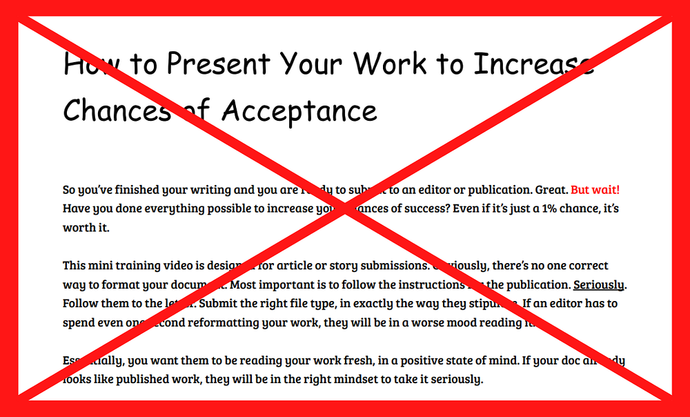
Let’s look at the issues with the document above. I’ve created this as an example of how NOT to present your work. It’s readable, but it’s certainly far from ideal. If this popped into my inbox as an editor, I would not be able to take the writing seriously.
Fonts, sizes, and colour
These are three things wrong with the version above.
For long-form written work, stick to serif or sans-serif fonts. The standards across most writing software are Arial, Helvetica, Calibri, Cambria, Times New Roman, Georgia, and Verdana. Choose whichever of these is closest to the font of the publication.
Your work must be instantly readable, so size matters. The standard would be 11 or 12 point, but the size of fonts vary. I personally choose 12-point Times New Roman. Also, titles do not need to be GIGANTIC. Be consistent with how you size titles and subheadings.
Finally, you shouldn’t use colour to highlight sections of your writing unless asked to do so. This may make it inaccessible to some readers. Additionally, it’s distracting.
Formatting: paragraphs, sections, and margins
Make sure that your paragraphs are well organised. They should match the style of writing you are submitting for. Long-form writing rarely requires extra spacing between paragraphs, so you can remove these. To indicate a new paragraph, ensure that the line begins with an indent (except for the first paragraph of a section). I use 0.25 indents as I think they look a little neater than 0.5 inches.
Use standard margins. It’s obvious to editors when writers have fiddled with the parameters of a document to fit more onto the page. We value concision, so submit work which is the right length. One-inch margins are the standard, but some fiction writers use even wider ones. This helps draw the reader’s eye down the page, as typically, more words fit onto a line of A4 text, than in a book.
You’ll notice some inconsistent formatting in the poor example above. Generally, we don’t want to break the lines of text by underlining words or phrases. Also, be consistent (and sparing) with your use of italicisation and bolding. Remember, the goal is to allow the reader to consume your words without any distractions or annoyances.
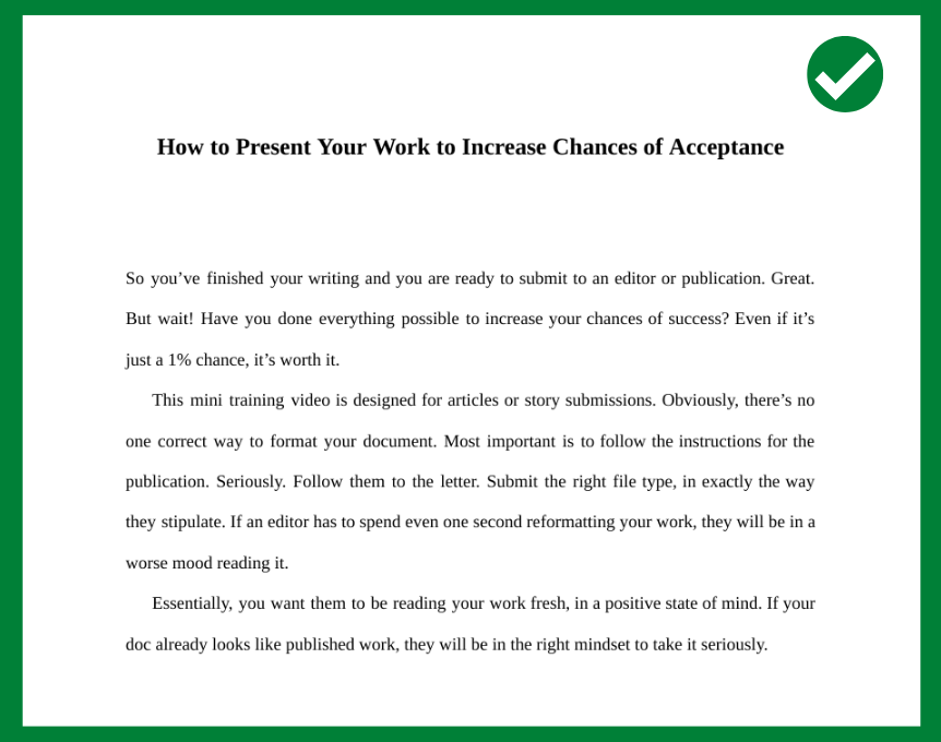
Typesetting and spacing
You can see a clearly formatted example above. I’ve followed all of the steps mentioned so far and have also amended the typesetting and spacing.
One added help to readers is to justify the text. This spaces words so that they touch both the left and right margins. You can find this option in the text alignment tools of most word-processing software. It aids quicker reading and simply looks neater.
You may wish to create a ‘drop’ for your title. This is achieved by adding line spaces above it, so your first section starts halfway down the page. Doing this is a good tip for fiction submissions, as it makes the work look like a chapter in a book. As I mentioned earlier, when your work looks published, editors read it in a more positive light.
In terms of line spacing, comply with the submission rules. Most guidelines have limits on word count instead of page numbers, so your choice here should not affect the ‘length’ of your document. If nothing is mentioned in the guidelines, I like to use double spacing to make the reading experience more pleasant. Allow your text to breathe!
Finally, zoom out to check your final version. Ensure there are no ‘orphans’ or ‘windows’. In typesetting, orphans are single words on a line, and windows are single lines of text that ‘dangle’ at the top or bottom of a page.
After completing these steps, your work will really be ready for submission, and your chances of success will rise.

Philip Charter is a writing coach from the UK who works with multilingual content writers. He is also the author of two collections of short fiction and Fifteen Brief Moments in Time, a novella-in-flash.